
1409: "The Hidden Patterns of Statistics"
Interesting Things with JC #1409: "The Hidden Patterns of Statistics" – Behind every bar chart and average lies a story that once shaped wars, saved lives, and even revealed new planets. What looks like homework is really training in how to find truth in a world full of uncertainty.
Curriculum - Episode Anchor
Episode Title: The Hidden Patterns of Statistics
Episode Number: 1409
Host: JC
Audience: Grades 9–12, college intro, homeschool, lifelong learners
Subject Area: Mathematics, History of Science, Data Literacy
Lesson Overview
By the end of this lesson, students will be able to:
Define key statistical concepts such as mean, median, mode, standard deviation, and outliers.
Compare different types of statistical representations (bar chart, pie chart, line graph, dot plot, histogram) and their historical uses.
Analyze historical case studies where statistics influenced major decisions (e.g., Florence Nightingale in healthcare, Neptune’s discovery, polio vaccine trials).
Explain how statistical methods continue to shape modern decision-making in science, economics, and medicine.
Key Vocabulary
Statistics (stuh-TIS-tiks) — The science of collecting, analyzing, and interpreting data; originally from the Latin status meaning “state.”
Outlier (OUT-ly-er) — A data point that is significantly different from others; for example, Neptune’s discovery was based on orbital outliers.
Median (MEE-dee-uhn) — The middle value in a dataset; in 2022 U.S. household income, the median showed a truer picture than the mean.
Standard Deviation (STAN-derd DEE-vee-AY-shun) — A measure of data spread around the average; used to test reliability in science and industry.
Normal Distribution (NOR-muhl dis-trib-YOO-shun) — The bell-curve shape many datasets take, with most values near the mean and fewer at the extremes.
Narrative Core
Open: Statistics begins with simple classroom tools like dot plots and averages, but these concepts connect to centuries of history.
Info: The word “statistics” comes from state record-keeping in the 1700s; early graphs emerged with William Playfair in the late 18th century.
Details: Key figures such as Florence Nightingale used graphs to drive public health reforms; outliers revealed Neptune’s existence and safeguarded polio vaccines.
Reflection: From median incomes to factory quality control, statistical measures reveal truth behind uncertainty.
Closing: These are interesting things, with JC.
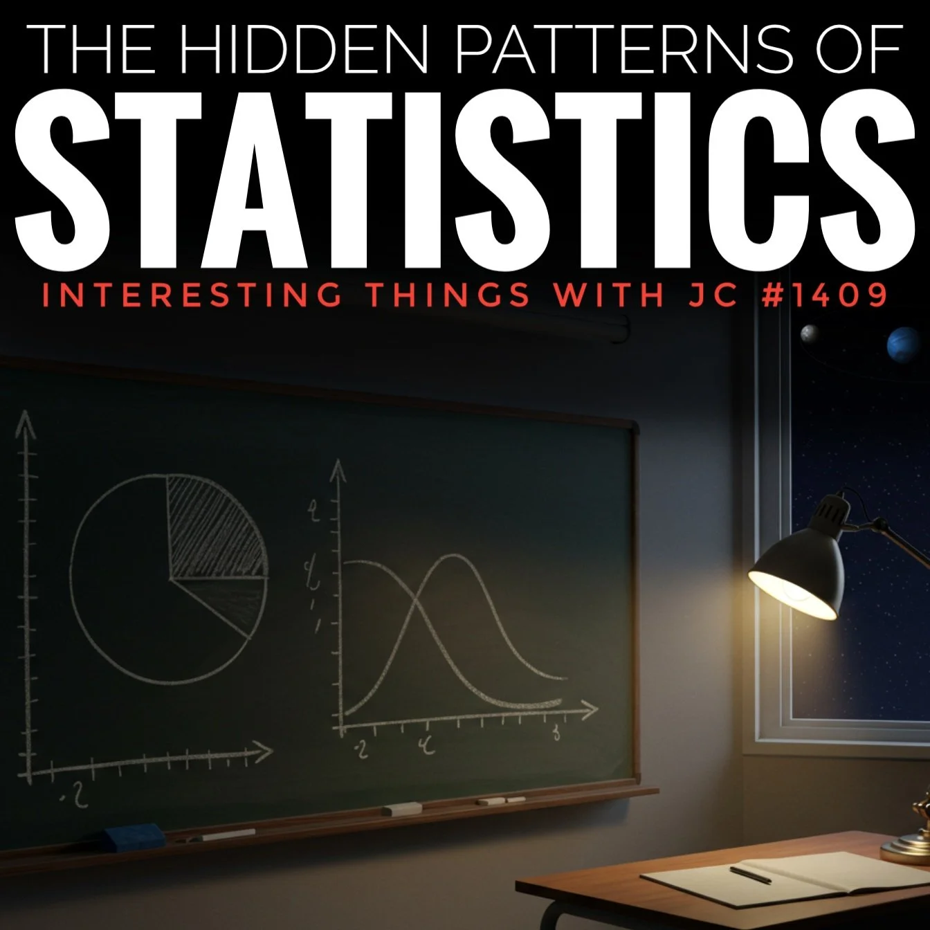
A classroom chalkboard shows a hand-drawn pie chart and overlapping bell curves in white chalk. A desk lamp glows on a wooden desk beneath the board, while through a window, the planets Neptune and Pluto appear against a dark starry sky. Large white and red text above reads: “The Hidden Patterns of Statistics – Interesting Things with JC #1409.”
Transcript
When most folks hear the word “statistics,” they picture numbers on a page, maybe a graph or two on the chalkboard. But the very first lessons in a stats class—simple things like dot plots, histograms, averages, and spotting oddball numbers—are part of a much bigger story. They’re the same tools people have been using for hundreds of years to make decisions that shaped history.
Even the name “statistics” goes back a ways. It comes from the Latin word status, meaning “state.” Back in the 1700s, governments were adding up crops, armies, and populations so leaders knew how strong their country was. Over time, those records turned into the science we study today. So when you’re working a homework set, you’re really using ideas that once guided kings, generals, and doctors.
Take graphs. In the late 1700s, a Scotsman named William Playfair (PLAY-fair) started drawing bar charts and line graphs. By 1801, he’d come up with the pie chart, too. He wanted people to see numbers instead of just reading them. A few decades later, Florence Nightingale (NIGH-ting-gale)—the famous nurse—used a circular chart during the Crimean War in the 1850s to prove more British soldiers were dying from disease than from fighting. That chart, which looked a lot like a pie chart, convinced the government to clean up hospitals. Something you practice on notebook paper once changed how wars were fought.
Now think about outliers—the numbers that don’t fit. Back in the early 1800s, astronomers noticed Uranus wasn’t orbiting quite right. It looked like bad data, but two mathematicians, Urbain Le Verrier (UR-ban luh-VAIR-ee-ay) in France and John Couch Adams in England, figured another planet must be tugging on it. Sure enough, in 1846 telescopes found Neptune almost exactly where their math said it’d be. One oddball point in the data revealed a brand-new planet. In medicine, outliers matter too. During the 1954 polio vaccine trials in the United States, a handful of unusual cases—paralysis after vaccination—turned out to be traced to a bad batch. Catching those outliers led to tighter safety rules that protected millions of kids.
The same goes for averages. We’ve got the mean, median, and mode. The mean, or plain average, can be thrown off by extremes. That’s why the median—the middle value—often tells the real story. In 2022, the median household income in the United States was about $74,580, but the mean was way higher, over $102,000. A few very high earners pulled the mean up. If you want to know what’s typical, the median is the number to look at. It’s the same lesson you learn when one really high test score throws off the class average.
Spread matters too. Back in the 1890s, a man named Karl Pearson (PEER-sun) came up with the formula for standard deviation, which shows how tightly numbers sit around the average. A low standard deviation means results are consistent. That’s how factories know if their ball bearings will roll smoothly and how doctors know if a new medicine works the same for most patients. If the spread is wide, you can’t trust the results. If it’s narrow, you’ve got something reliable.
And then there’s shape—how the data looks when you plot it. The bell curve, or normal distribution, shows up all over the place: heights, test scores, even small errors in manufacturing. Most things land near the middle, fewer out at the edges. When the data doesn’t follow that shape, something unusual is going on. That’s how scientists spot problems, whether it’s a factory flaw or the first sign of an outbreak.
Picture a classroom now. Chalk dust on the teacher’s sleeve, the squeak of a marker on the board, the neat rows of farm fields outside town that look a lot like bars on a chart. Those everyday sights carry the same logic as the graphs you practice in class. And think of Florence Nightingale’s lamp glowing in a dark hospital, paired with the desk lamp that burns late at night before your test. Those images, simple and familiar, carry the same message: statistics is the work of finding truth in a world full of uncertainty.
So here’s the point: the first unit of statistics may seem basic, but it’s not. Those same simple graphs and averages once helped reform hospitals, discover planets, and keep vaccines safe. And when you, sitting in a classroom in the Midwest or anywhere else, draw a bar chart or calculate a median, you’re taking part in that same tradition. What looks like homework is really training in how to find truth in a sea of numbers.
These are interesting things, with JC.
Student Worksheet
How did Florence Nightingale use charts to influence public health reforms?
Why did astronomers think Neptune existed before it was observed with a telescope?
Compare the mean and median household income figures in 2022. What do they reveal about U.S. income distribution?
Explain why standard deviation is important in both manufacturing and medicine.
Create a quick sketch of a bell curve. Label where most values fall and where the outliers would appear.
Teacher Guide
Estimated Time: 1–2 class periods (45–60 minutes each)
Pre-Teaching Vocabulary Strategy: Use word cards with terms like “outlier,” “standard deviation,” and “normal distribution,” and have students match them with real-world examples.
Anticipated Misconceptions:
Students may confuse mean and median.
Students may assume outliers should always be discarded rather than investigated.
Discussion Prompts:
How can one unusual data point change history?
Which is more powerful: numbers on a page or numbers in a chart? Why?
Differentiation Strategies:
ESL: Use visuals (charts, graphs) alongside text.
IEP: Break calculations into step-by-step guided practice.
Gifted: Challenge students to research and present a modern case where statistics changed policy.
Extension Activities:
Analyze recent statistics in news articles and evaluate whether mean or median is more informative.
Replicate Florence Nightingale’s chart using modern software.
Cross-Curricular Connections:
History: Role of statistics in governance and warfare.
Science: Use of data in medicine and astronomy.
Economics: Interpreting income distribution.
Quiz
Who is credited with inventing the pie chart?
A. Karl Pearson
B. William Playfair
C. Florence Nightingale
D. John Couch Adams
Answer: BWhat did Florence Nightingale’s chart during the Crimean War demonstrate?
A. Soldiers needed better weapons
B. Disease killed more soldiers than combat
C. Britain required more hospitals in London
D. Food shortages caused illness
Answer: BWhich planet was discovered due to statistical analysis of orbital outliers?
A. Jupiter
B. Saturn
C. Neptune
D. Mars
Answer: CWhat does a low standard deviation indicate?
A. Results are highly inconsistent
B. Results are tightly clustered around the mean
C. Data is skewed to the right
D. The mean and median are the same
Answer: BIn 2022, why was the median U.S. household income more useful than the mean?
A. It ignored taxes
B. It showed the impact of very high earners
C. It excluded households under poverty
D. It measured spending instead of earnings
Answer: B
Assessment
Explain how outliers can either reveal mistakes in data or lead to important discoveries. Use at least two historical examples from the episode.
Analyze the strengths and weaknesses of using the mean versus the median in real-world decision-making. Provide modern examples.
Rubric (3–2–1):
3: Accurate, complete, thoughtful response with examples.
2: Partial or missing details; some inaccuracies.
1: Inaccurate or vague response with little detail.
Standards Alignment
CCSS.MATH.CONTENT.HSS.ID.A.1: Represent data with plots on the real number line (dot plots, histograms, box plots).
CCSS.MATH.CONTENT.HSS.ID.A.2: Use statistics to compare center (mean, median) and spread (standard deviation, IQR).
CCSS.ELA-LITERACY.RH.9-10.3: Analyze historical evidence and data-driven arguments.
NGSS HS-ETS1-3: Evaluate solutions to complex real-world problems based on reliability of data.
ISTE Standard 5c: Students collect and analyze data to make informed decisions.
C3 Framework D4.2.9-12: Construct explanations using data and evidence.
International Equivalents:
UK GCSE Mathematics (Edexcel 1MA1, Statistics): Interpret and represent data using averages, spread, and charts.
IB DP Mathematics: Applications & Interpretation SL/HL: Topic on statistical analysis and interpretation of data.
Cambridge IGCSE Mathematics (0580, Statistics): Representation and interpretation of statistical data, including mean, median, mode, and standard deviation.
Show Notes
In this episode, JC uncovers the hidden patterns behind statistics, tracing their journey from 18th-century state records to modern classrooms and laboratories. From William Playfair’s invention of graphs to Florence Nightingale’s reforms in hospital sanitation, statistics has shaped wars, medicine, and even the discovery of Neptune. Today, students learning about mean, median, mode, outliers, and standard deviation are practicing the same methods that influenced history. This episode brings mathematical concepts alive by showing their historical importance and continued relevance, making it an ideal bridge between mathematics, history, and critical thinking.
References
Spence, I., & Wainer, H. (2001). Playfair’s Commercial and Political Atlas and Statistical Breviary. Cambridge University Press. https://notes.math.ca/en/article/william-playfairs-statistical-graphs/
Friendly, M. (n.d.). Florence Nightingale’s Polar-Area Diagram. Agnes Scott College, Math Women Project. Retrieved September 15, 2025, from https://mathwomen.agnesscott.org/women/nightpiechart.htm
MacTutor History of Mathematics Archive. (n.d.). Karl Pearson. University of St Andrews. Retrieved September 15, 2025, from https://mathshistory.st-andrews.ac.uk/Biographies/Pearson/
Rodríguez-Moris, G. (2024). The discovery of Neptune revisited. arXiv. https://arxiv.org/pdf/2405.06310
“Pluto: A timeline of 85 years of discovery.” (2015). Science News. Retrieved September 15, 2025, from https://www.sciencenews.org/article/pluto-timeline-85-years-discovery
“Pluto discovery and the ‘Planet X’ hypothesis.” (n.d.). Encyclopaedia Britannica. Retrieved September 15, 2025, from https://www.britannica.com/list/10-important-dates-in-pluto-history
Francis, T., Jr. (1957). Evaluation of the 1954 Field Trial of Poliomyelitis Vaccine: Final Report. Poliomyelitis Vaccine Evaluation Center, University of Michigan. https://sph.umich.edu/polio/
Fitzpatrick, M., & Lipton, B. H. (2006). The Cutter incident: How America’s first polio vaccine led to the growing vaccine crisis. Bulletin of the History of Medicine, 80(4), 801-830. https://pmc.ncbi.nlm.nih.gov/articles/PMC1383764/
Guzman, G. (2023). Income in the United States: 2022 (Report No. P60-279). U.S. Census Bureau. Retrieved September 15, 2025, from https://www.census.gov/library/publications/2023/demo/p60-279.html